With all the painstaking research I’ve been doing for my college football previews, I got to thinking about uniforms. Specifically, who looks good and who doesn’t. So here it is, my best of each conference.
ACC
Best: Virginia -everything works for me except the truncated stripes on the helmet. Love the logo and color scheme.
Honorable Mention: Florida State- better when they stick to the basics. North Carolina-bad team, great colors. Clemson- one of the great things about college football: it makes people believe that orange and purple look good together.
Worst: Miami-awful colors, and the princes of needless stripes. Stay tuned, they’ve updated again; it is going to get worse
Dishonorable Mention: Duke-dark blue uniforms with black numbers and black pants? Aren’t Dukies supposed to be smart? Virginia Tech-Orange and Maroon? Seriously? Nothing can be done when you start at that point. Another team with way too many different looks.
Big East
Best: Pittsburgh- best of a weak conference, the Panthers lost some distinctiveness when they moved away from the mustard yellow and PITT emblem, but this will work.
Honorable Mention: Nobody
Worst: Temple-the Owls don’t do anything right. The fierce Owl logo is goofy, and again with the black on red look.
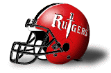
Dishonorable Mention: Nobody really, but Rutgers went way to far towards the bland when they canceled this cool lookin’ helmet.
Big 10
Best: Michigan-like the New York Yankees; UM is simple, classy and memorable. The best uniforms in college football, easily.
Honorable Mention: Ohio State-Same sort of feel as Michigan. I once met a man who claimed he would sell his soul for a buckeye sticker. Michigan State-One of the better recent changes, they should have been using the Spartan head logo for a long time now.
Worst: Penn State-I know I’m in the minority here, but I don’t think the Lions should get any credit for wearing the practice unis on Saturday. I also dislike them for being such purists they leave off a logo, player name and oftentimes a bowl logo, but the Nike swoosh is all over the damned things.
Dishonorable Mention: Northwestern-I have no idea what they’re doing here. Purple, black and white with weird shapes and stripes, plus the worst numbers in the game; it’s just awful.
Big 12
Best: TIE, Oklahoma, Texas and Nebraska-I know it’s a cop-out, but these are three of the best traditional looks in college football, and all three have done will with some occasional tweaking.
Honorable Mention: Kansas- A very nice recent change, nothing fancy, but very effective. Of course, the new darker blue doesn’t look anything like the actual school colors. That’s a mistake.
Worst: Iowa State-just plain dreadfull.
Dishonorable Mention: Texas Tech- I hate the black pants and solid color jerseys with a passion.
Conference USA
Best: Memphis- yeah, they should still be Memphis State, but the blue and silver color scheme is nicely understated, and the Tiger logo is good.
Honorable Mention: Louisville-a little overbaked, but distinctive.
Worst: TIE, Cincinnati and TCU- dammit, as I told you before, no black pants with solid color tops. I don’t know what is worse, TCU’s sickly purple or UC’s red.
Dishonorable Mention: South Florida-Black and Gold? Such original colors you have. Also loses points for South Florida meaning Tampa.
Mid-American Conference
Best: Bowling Green- you have to love it; a university with the word green in it goes with bright orange. Toss in that hideous 70’s throwback logo, and it becomes bad taste heaven.
Honorable Mention: Toledo-not very pretty, but always adventurous, which is something in a conference filled with rip-offs.
Worst: the NFL swipes, Akron (seen many St. Louis Ram games?), Western Michigan (we’ll be the Denver Broncos, only browner) and Kent State (the Chargers, but uglier)
Dishonorable Mention: Buffalo- perfectly serviceable, but what the hell is that shape on the helmet supposed to be?
Mountain West
Best: Colorado State-it isn’t easy to get Green and Gold right, but the Rams do it well. Great road unis.
Honorable Mention: Air Force-lighting bolts are always cool. Same with the Falcon logo
Worst: Wyoming- Brown, white and…I dunno, urine? The gold-yellow-khaki color is atrocious, and perfectly complements the shit brown jerseys.
Dishonorable Mention: San Diego State- lots and lots of black thank you very much. Add some mustard yellow and orangeish red, top it with awful “airbrushed” helmets and Viola… hideous uniforms.
Pac-10
Best: UCLA-the powder blue and gold perfectly encapsulate west coast sports. It’s not usually something football players aspire too, but the Bruins can only be described as pretty.
Honorable Mention: Washington- a great look nearly ruined by over-tweaking. Get rid of the damned shoulder stripes and rounded off numbers. It can’t be just coincidence that the Huskies started playing like sick nuns after adopting this stuff. Washington State-it’s too heavy on the stripes, and I wish the Grey in Crimson in Grey got paid attention too, but the Cougar head logo is just perfect. Can you believe it took these people 50 years to put in on the helmet? USC-I hate ‘em, but they’ve done nothing but win since they went to the 70’s Trojan throwbacks.
Worst: Oregon-where do we start with these guys? It got slightly better with the green and black bodysuits going away, but the Highlighter uniforms? Does the world really need this? The white uniforms still look oddly feminine too.
Dishonorable Mention: Oregon State-what on earth is wrong with the state of Oregon? Black on black on black or black on orange, take your pick, it’s ugly all around.
SEC
Best: Alabama-simple, old-school uniforms, and the best shade of red in the land.
Honorable Mention: Ole Miss-once you get past the whole Confederacy fixation, the Rebels uniforms are pretty sweet, especially the red jersey variant. Tennessee-love it or hate it, this orange might be the most recognizable look in the sport.
Worst: Arkansas-what is with these pants? The stripes change shape on the way down the leg. Why? The Hogs also get props for not matching the red in the jerseys with the red on their helmets. Classy….
Dishonorable Mention: Florida-just too many damn choices; blue jerseys, white jerseys, white pants, blue pants, orange pants.. Pick a scheme people.
Sun Belt
Best: Middle Tennessee-or is that Middle Tennessee State? Anyway, while a little too blue for my taste, this is the best of a weak class.
Honorable Mention:None
Worst: Utah State-almost as boring as Penn State, and the Lions are actually trying.
Dishonorable Mention:None
WAC
Best: Boise State-garish, but in a good way. It is especially fun when the blue-clad Broncos blend in with the field.
Honorable Mention: UTEP-another nice mix of blue and orange. I especially like the shoulder stripes.
Worst: San Jose State-this is what happens when blind people design uniforms. Really, there are no words for this.
Dishonorable Mention: Hawaii-they dropped the lovely green uniforms and “rainbow” portion of their name so no one confused them with gays. Cuz, everybody knows that there are no gays in football or Hawaii. To complete this stupidity, they let Nike design the uniforms, which is the kiss of death. Black and green, with a goofy garter around the right thigh: it may be ugly, but it’s not gay!
Loved the comment about Nike designing Hawaii's uniforms. Look what Nike did to BYU with the bib in 2001. They've ditched the bibs, but the new helmet logo and colors have had mixed results and they're going back to the white helmet this year with the old logo and losing the TAN from their uniforms.
Posted by: Craig at April 1, 2005 09:17 AMI really don't like BYU, but they came pretty damned close to having a timeless uni like Nebraska or Ohio State. To have Nike screw it up like that is just tragic. Go back to the blue and whites, and for chrissakes, let them wear cutoff jerseys. It was okay for McMahon, wasn't it?
Posted by: frinklin at April 1, 2005 06:26 PM
.jpg)