NFC East
1-New York Giants
These are the best of the throwback style jerseys as far as I’m concerned. A few years ago, the Giants got rid off their blandly futuristic version and brought these back: classic color scheme, classic “NY” logo, and the best road jerseys in football.
2-Dallas Cowboys
The original futuristic uniform has aged pretty well, though the Cowboys should stick to the white jersey as much as possible, the dark uni has never quite worked right. The helmet is an icon both in football and in America in general.
3-Philadelphia Eagles
A team that was desperately in need of a uniform upgrade got one a few years ago, and the results have been decidedly mixed. The main color was changed from a light Kelly green to a dark forest green, and while it looks good, it doesn’t really look like the Eagles. The increasing use of black, culminating in these ridiculous alternate uniforms is a strike against them too.
4-Washington Redskins
To get this out of the way: Yes, I think the “Redskin” moniker is incredibly racist. I have no problem with Indians, Warriors, various tribal names, Fighting Irish or what-have-you. Now, I’m not a member of any of those said groups, so maybe they have problems I don’t. Really though, isn’t Redskin just plain offensive? Is it conceivable that in 2004 we have a major sports franchise named after a racial epithet? As for the uniforms, they are okay but bland. Washington’s best look is the home reds with white pants. I do give them credit for having a dignified logo. The name is awful, but they don’t compound the problem with something like Cleveland’s red-faced Chief Wahoo. I do like the old-school uniforms they wore in 2002.
NFC South
1-New Orleans Saints
The Saints are the best of a lousy lot. The black and gold color scheme works together, and they fleur-de-lys logo is both traditional and slick, much like the city itself. The Saints do best when they don’t get too fancy: Black jersey, gold pants at home, white jersey and black pants on the road. Please, none of this gold jersey and black pants or black on black mess.
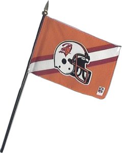
2-Tampa Bay Buccaneers
After two decades of being the Gayest Pirates Ever, the Buccaneers have now settled into their tough and manly look of pewter and orangeish-red. Yeah, great big improvement people. First, the shade of orange and/or red is hideous, and the pewter is well… Can’t you go for silver? The helmets are cool, and the redone logo is one of the best in football, but those colors just do not work.
Bring back the Creamsicles!
3-Carolina Panthers
Let’s see here: black logo on silver helmet, black jersey, silver pants and black stripe. Now where have I seen that before? Of all the many lawsuits that Al Davis throws at the NFL, this one might have the most merit, as the Panthers shamelessly swiped the Raiders look. Now they did add a splash of overly bright Carolina blue, and an awful bright alternate jersey. So Panther fans you have a choice: derivative or ugly?
4-Altanta Falcons
For years, the glory years of Steve Bartkowski and William Anderson, the Falcons had fine red uniforms and red helmets. Then Hurricane Glanville came along and changed the Falcons to black jerseys with black helmets…with black logo. Nahh, we’re not trying to be trendy. Anyway, after a dozen years of that look that I shamefully, secretly liked, the Falcons came out with their current monstrosities. It’s quite easy to see that Atlanta’s design teams like stripes. Lots and lots of stripes. Black stripes, red stripes and white stripes. Horizontal stripes, vertical stripes and diagonal stripes. They also are positively Diamonbackian in their need for possible combinations. Right now, the Falcons can throw out black on white, black on black, red on white, red on black, white on white and white on black jersey/pants combos. Please, just stop it! The Falcons encapsulate everything that’s wrong with NFL jerseys right now.
NFC North
1-Chicago Bears
When it’s easy to see the team’s best player from 40 years ago wearing the current uniform, it’s usually a good thing. It would be easy to see Dick Butkus or Gale Sayers wearing today’s Bear uniform. It features the same iconic “C” logo, same colors (though the team has alternated between calling it black or dark navy blue). The Bears have tweaked it of course, and played around with dark pants and an alternate Orange jersey. Neither are necessary, the Bears look is classic.
2-Detroit Lions
Last year the Lions updated yet another classic NFL look. It went well, but with a giant red (or rather, black) flag. The Lions kept their beautiful light blue and silver color scheme, and distinctive leaping lion logo, but they added black. It isn’t much, just black stripes on the sleeve and outline of the numbers, but its enough to raise the hackles on my neck. Not this year, maybe not next, but sometime in the next 3-4 years you’ll see an alternate black jersey, available at the NFL shop for the low, low price of $159.99.
3-Green Bay Packers
Speaking of classic, much of the above can be said for the Packers as well. They have an iconic logo, classic color scheme, and not too much of a stretch to see Jim Taylor in today’s green and gold. Therein lies the rub: green and gold is a serious personal judgment call. Some people love it, some hate it. If you like green and gold, you’ll probably like the Packers uniforms’ If not… Personally, I like green and gold if done well (GB, Seattle Supersonics uniforms) and hate if done poorly (nearly everything Oregon-related).
4-Minnesota Vikings
How great is it that all four teams in the NFC North have the same basic look they had when Minnesota joined the league? This look is again distinctive, but doesn’t work quite as well in my eyes. The purple is a good start, but I feel that purple needs a stronger second color than white, like gold or silver. I have never been a fan of the horned helmet either. Still, much better than most.
NFC West
1-San Francisco 49ers
This is a difficult division to judge, since none of these teams do everything right or everything wrong. All have potential, but few live up to it. The 49ers probably come the closest, with an updated version of their classic look. The logo and colors are tweaked but still similar, though I think they could use a downturn on the brightness button for both the red and gold.
2-Seattle Seahawks
The ‘Hawks could have great uniforms. They have some of the elements: killer logo, nice basic color scheme (I really like the Seahawk Blue), and terrific road uniforms. They just go overboard on the blue. The home uniform should be a blue jersey, white pants and blue helmet, but due to some problems with the white pants when they first adopted the look, the team ended up using the blue pants instead. For some inexplicable reason, this has stuck, and the Seahawks have adopted this monochrome look full-time. The blue helmet plus blue jersey plus blue pants equals waaaay too much blue. Equally inexplicably, they sometimes abandon their best look, the road whites with blue pants in favor of an all-white look. The original plan was to use silver helmets with the home uniforms, which I think would have been incredibly cool, but the No Fun League had to step in and stipulate that teams couldn’t have separate home and road helmets. Therefore, the Seahawks had the fans vote, and the blue helmet won in a landslide. I’d love to see the team ignore that, bring back silver helmets and silver pants with the Seahawk Blue jersey. It would look much better than the current monochrome.
3-St. Louis Rams
Like the Seahawks and 49ers, this is a team with elements of a good uniform, but it’s not all there. Really, the Rams shouldn’t have changed from the old LA blue and yellow to the navy and gold they currently sport. The navy pants don’t’ work either. They have kept one of the most recognizable helmets in football.
4-Arizona Cardinals
Bland, but not really ugly, the Cardinals get downgraded for not really trying in any manner to adapt to their current city. Other than the occasional appearance of the Arizona state flag and some pretty slick red pants, the Cardinals are still wearing the same uniforms they did in St. Louis. While I like tradition, there’s also something to be said for adapting to new surroundings.
Best NFC Uniforms
1. New York Giants
2. Chicago Bears
3. Detroit Lions
Alternate-Washington Redskins
Worst NFC Uniforms
1. Atlanta Falcons
2. Carolina Panthers
3. Minnesota Vikings
Alternate-Philadelphia Eagles
Previously: The AFC, College Best and Worst
Posted by Frinklin at August 18, 2004 08:04 PMHey Frinklin, I'm confused: the Redskins get the alternate slot for Best NFC uniforms, and you ranked them fourth in their own division? Am I reading the rankings wrong, or is this an example of creative scoring?
Posted by: Mediocre Fred at August 19, 2004 09:51 AMWell, Fred, it is an example of creative scoring, especially when you consider the team with the worst alternate finished directly above them. I just don't like the Skins base uniforms, but I do like the throwback, and I'm actually kind of stunned they didn't switch full time.
Also, the alternates in the NFC almost uniformly suck, like Carolina's blue jersey, Chicago's orange, and Green Bay's yellow.
Posted by: frinklin at August 19, 2004 05:30 PMbah, axei muito afuder as fotos, os uniformes tbem... eu sou aqui do Brasil e curto esse esporte... pena q nao tem aqui, mas um dia eu vou morar aeew soh pra joga futebol americano era issu aeew, falow
Posted by: Geovani Dummer at September 14, 2005 08:49 PM