March 16, 2007
Frinklin Fashion Show: New Charger Jersey
I couldn't let the week go without touching on the new San Diego Charger uniforms. The Missus has made it clear she dislikes them. I'm not thrilled with the new look, but I will say it's an improvement on the previous look, which had aged.
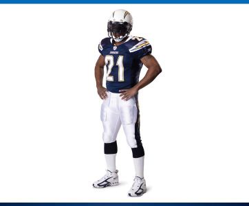
This is the standard home uniform. Again, an improvement over the old look. I love the white helmet, especially if they can keep the pearlescent finish throughout the year. The new look adds the gorgeous powder blue as an accent color in both the logo and the lightning bolt. It's a nice touch, but I wonder if it might help to drop the darker outline. The numbers are as good as any stylized numbers you'll find in the NFL. I'm less thrilled with the bolt down the pants, and the bolt across the shoulders combined with the numbers on top look a little busy. White shoes work with a California team.
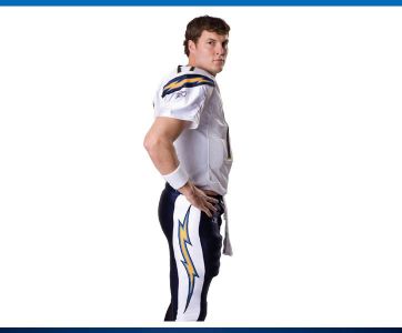
This angle gives a better look on the lightning bolt down the pants. It looks goofy and overdone. I doubt the Chargers will go the year without doing a white-on-white look.
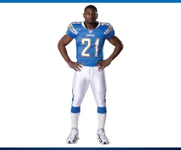
This -the new official alternate jersey- just pisses me off. The Chargers have the single best uniform in the history of the NFL. Nothing comes close. It's as good a uniform as the Yankees' home pinstripes and the Maple Leafs' blues. So why screw it up? The color isn't the only good thing about the old Charger uniforms. Hell, the Titans do a similar blue and that look is hideous. Drop these overdone alternate uniforms and just bring back the throwbacks. Hell, just use them all the time. Are the new uniforms better than the olds? Yeah, they probably are. Just nothing close as good as they could be Posted by Frinklin at March 16, 2007 10:32 PM | TrackBack
Your new jerseys kick azz,pleaze use them well.
CHARGERS RULE!!!!!!
Posted by: jorge mendoza at March 24, 2007 04:49 PM